Cornerstone Fellowship Nottingham UK is a church that discovered its true identity during the Covid pandemic. Breaking away from tradition, the church embraces dynamic services and steps beyond its walls to make a tangible impact in the community.
-
Church branding frequently falls into a pattern, posing the question: How can we creatively integrate a ‘cross’ into a logo? This routine approach often leads to the core messages of hope and love being overlooked in a society that requires them in abundance.
We collaborated with Cornerstone Fellowship to develop a brand that transcended conventional boundaries typically associated with a Christian organisation. Our aim was to make an immediate impact on the community the church serves, embodying a personality that is bold, visible, and unapologetic.
Breaking From Tradition
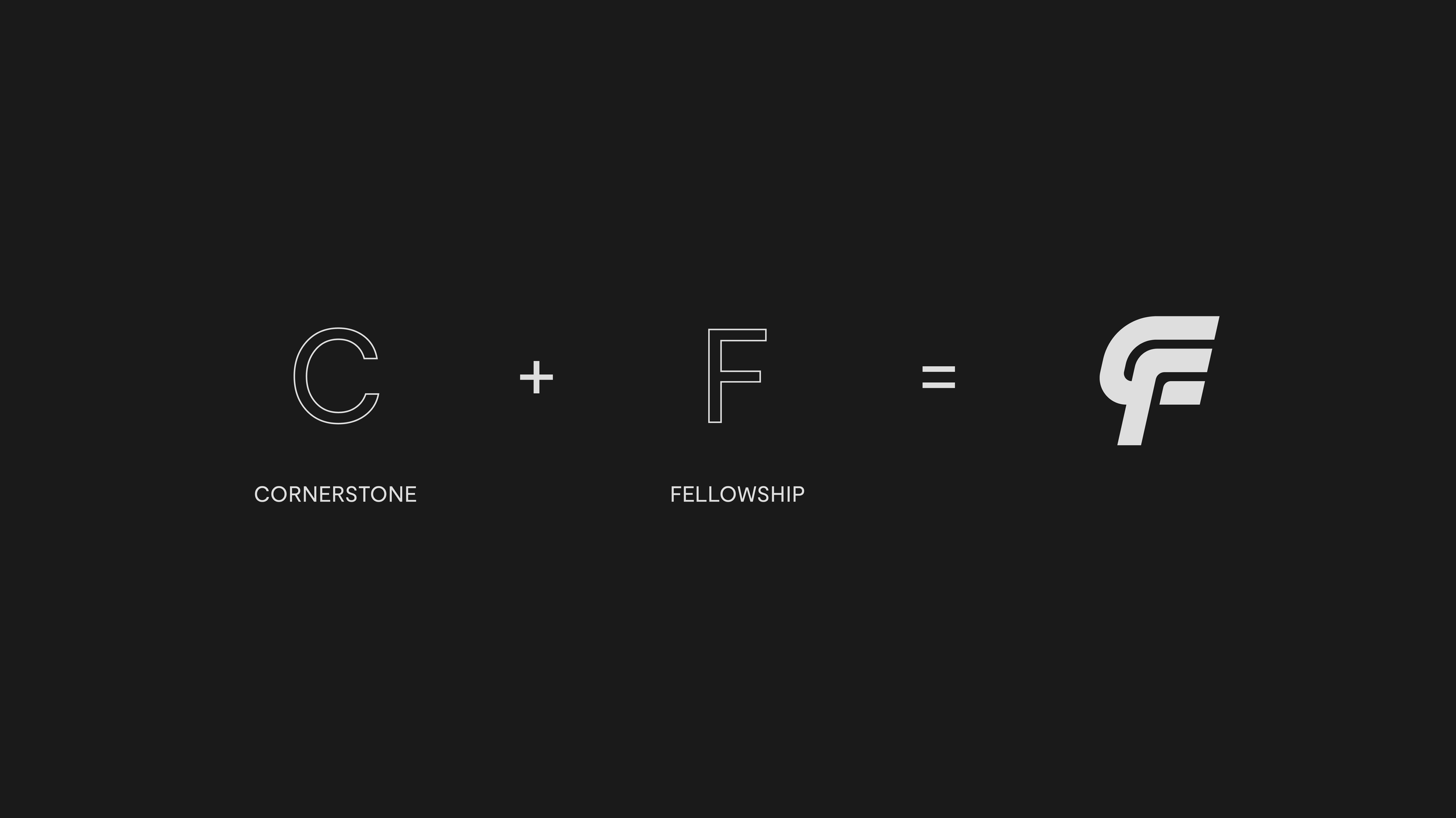
The Cornerstone Fellowship Mark signifies a departure from traditional cultural and religious norms. It is unapologetically bold, disruptive, and demands attention.
The initials “C” and “F” are crafted into a distinctive and professional design that is instantly recognisable.
-
We had the opportunity to launch a distinctive brand, powered by Cornerstone’s willingness to challenge the status quo.
Cornerstone Fellowship Nottingham UK is a church that discovered its true identity during the Covid pandemic. Breaking away from tradition, the church embraces dynamic services and steps beyond its walls to make a tangible impact in the community. Their mission is to bring value to those seeking to know and love Jesus, encapsulated in their motto: “The least likely is the most likely.”
The new Cornerstone Fellowship Mark represents a significant shift from established cultural and religious conventions. It is confidently bold, challenging, and certainly captures attention. The chosen colour palette intentionally avoids conventional options, opting for shades that are striking and impossible to ignore.


